
Cornices may appear simple at first glance, but small changes in the visible profile can create very different design expressions.
A straight lower edge can feel quiet and architectural, while curves, scallops, stepped shapes, overlays, and asymmetrical profiles introduce varying degrees of softness, movement, and decoration.
Terminology is not always consistent across manufacturers, workrooms, and custom window treatment brands. Similar shapes may be given different product names, while some companies use letters, numbers, or proprietary style names.
For that reason, this article is not intended to create a formal classification system.
Instead, it is designed as a visual reference for the design process—making it easier to compare cornice shapes, surface treatments, and decorative details in one place.
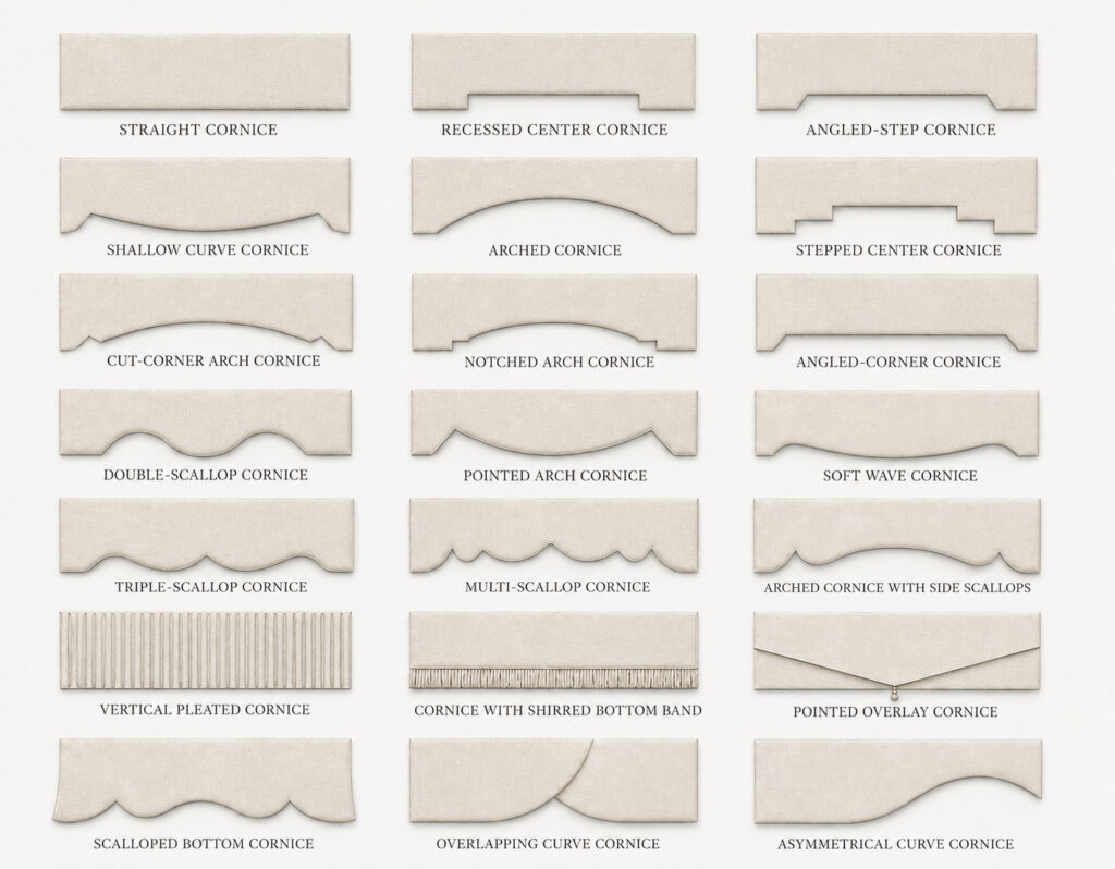
How to Read This Reference
When comparing cornice designs, it can be helpful to look beyond the name and focus on the visible design language.
Some profiles are defined mainly by geometry: straight lines, recessed centers, angled corners, or stepped edges.
Others depend on curves, arches, scallops, or waves to soften the lower silhouette.
Surface treatments can also change the character of a cornice without changing its basic outline. Vertical pleats, shirred banding, layered fabric, and other textile details add rhythm and depth to an otherwise simple shape.
Layered and asymmetrical profiles create another type of visual movement, often drawing the eye toward a center point or across the width of the treatment.
Shape and Visual Character
Straight and geometric cornices generally create a more controlled, tailored impression.
They can work well when the surrounding architecture already has strong lines or when the top treatment is intended to remain visually quiet.
Curved and arched profiles introduce softness while still maintaining a relatively structured form.
The depth of the curve matters. A shallow arch may feel subtle, while a deeper or more pointed curve can become a stronger feature within the window composition.
Scalloped and wave-shaped profiles create more rhythm along the lower edge.
The number, scale, and spacing of the curves can make the treatment feel restrained, traditional, playful, or decorative.
Overlay and asymmetrical forms introduce more directional movement.
Because the lower edge is no longer read as one continuous symmetrical line, these designs can feel more expressive and visually active.
Surface Details Matter Too
Not every cornice variation comes from the shape of the board itself.
Fabric treatment can become an important part of the design.
Vertical hand-folded pleats create a repeated architectural rhythm across the face of the cornice.
A shirred bottom band introduces softer textile detail along the lower edge and can be made in a matching or contrasting fabric.
Layered fabric treatments can create additional depth without requiring a more complicated overall profile.
These surface details are especially useful when the designer wants a simple cornice shape but does not want the finished treatment to feel completely plain.
Choosing a Cornice by Visual Direction
During the early design process, it is often more useful to begin with the desired visual direction rather than a specific product name.
Consider whether the cornice should feel:
- straight or curved;
- geometric or soft;
- symmetrical or asymmetrical;
- tailored or decorative;
- quiet or expressive;
- simple in profile or detailed through fabric treatment.
The relationship between the cornice and the rest of the window treatment is equally important.
Its height, width, projection, fabric, pattern scale, and relationship with drapery, Roman shades, woven shades, or other layers can all influence the final effect.
A profile that feels subtle on a narrow window may become much more dominant when extended across a wide opening.
A Note on Terminology
Cornice names vary widely across manufacturers and custom workrooms.
Some companies use proprietary names, while others identify similar shapes with letters, numbers, or broad style descriptions.
The labels used in this visual reference are therefore descriptive rather than universal.
Their purpose is to make visual comparison easier during the design process.
In practice, the most important information is often not the name itself, but the profile, proportion, edge detail, surface treatment, and overall visual direction being requested.
Related Reading
If you would like to explore related window treatment design ideas, these guides may also be useful:
- Exploring Valance Styles: A Visual Reference for Design and Structure — A comparison of common valance forms and the structural details that shape their appearance.
- Drapery Length, Coverage, and Layering: A Visual Guide — How drapery length, coverage, opening direction, and layering influence the overall window composition.
- Understanding Drapery Heading Styles — A visual reference to common drapery headings and the different visual rhythms they create.
- Understanding Roman Shade Styles — A guide to the visual and construction differences among common Roman shade styles.
Comments are closed.