
In my design work, I often explore color blocking and banding as ways to introduce different fabric combinations into custom drapery.
Over time, I have found it useful to keep a visual reference of different layouts, proportions, and color combinations. I spent some time organizing these design variations into a collection that I can return to during the design process, and I hope it may also provide inspiration for other designers working on similar projects.
By changing the placement, proportion, and combination of fabrics, even a relatively simple drapery panel can take on a very different visual character.
This guide brings together ten design variations, along with color palette studies and a few interior applications, as a practical reference for custom drapery design.
1. Understanding Color Blocking and Banding
Color Blocking refers to the use of larger sections of contrasting or coordinating fabrics to create distinct areas within a drapery panel.
These sections may appear at the top, bottom, or middle of a panel, or be repeated to create a horizontal rhythm.
Banding generally introduces narrower decorative sections of fabric along an edge, across a panel, or between larger fabric sections.
Banding may be subtle and tonal, or used as a contrasting detail to emphasize a particular line.
The two approaches often overlap. A single drapery design may combine large color blocks with narrow decorative bands, creating both visual structure and additional detail.
2. Common Design Variations and Proportions
The following illustration presents ten design variations, exploring different ways to arrange color blocks and decorative bands.
The examples include proportional divisions based on finished drapery length, as well as fixed-width decorative sections.
These dimensions are intended as design references rather than universal standards. Actual proportions may be adjusted according to window height, fabric selection, and the desired visual effect.
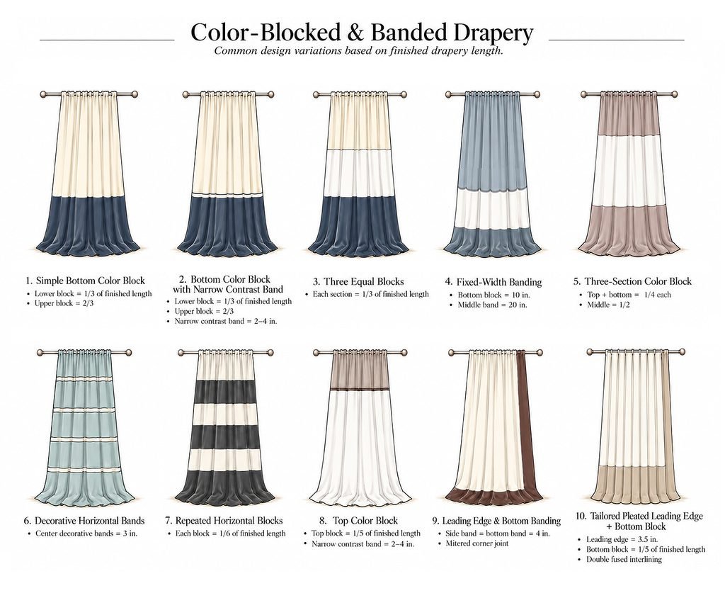
Bottom Color Blocking
One of the simplest approaches is to introduce a contrasting fabric at the bottom of a drapery panel.
A lower block occupying approximately one-third of the finished length creates a distinct horizontal division while allowing the upper fabric to remain visually dominant.
A narrow contrast band can also be introduced between the two larger sections.
This additional detail emphasizes the transition between fabrics without significantly changing the overall composition.
Three-Section Color Blocking
Dividing a drapery panel into three sections creates additional opportunities for balancing color and proportion.
Three equally sized sections establish a regular horizontal rhythm.
Alternatively, smaller upper and lower sections can frame a larger central area.
The visual effect depends not only on the proportions but also on which colors occupy each section. A darker middle section, for example, creates a different impression from a design with darker fabric at the top and bottom.
Fixed-Width Banding
Not every design needs to follow a proportional division.
Some decorative layouts use fixed dimensions, such as a 20-inch middle band combined with a 10-inch bottom block.
This approach keeps the decorative sections at consistent physical dimensions across different panel lengths.
However, the visual proportion changes as the overall drapery length increases or decreases.
When comparing these two approaches, it is useful to consider whether the priority is maintaining a consistent band width or preserving a consistent visual proportion.
Repeated Horizontal Blocks and Decorative Bands
Repeated horizontal sections can introduce a stronger graphic rhythm.
Wider alternating color blocks create clearly defined divisions, while narrow decorative bands can provide a more understated effect.
The number of divisions, their spacing, and the contrast between fabrics all influence the overall appearance.
Top Color Blocking
Placing a contrasting section at the top of a drapery panel draws attention toward the heading and upper window area.
This approach may also incorporate a narrow contrast band at the transition between fabrics.
The relationship between the top block, mounting height, and surrounding wall color is particularly important when evaluating the composition.
Leading-Edge and Bottom Banding
Color blocking does not need to be limited to horizontal divisions.
A contrasting fabric can run vertically along the leading edge and continue across the bottom of a panel.
This creates a combination of vertical and horizontal lines that emphasizes the drapery’s outline.
A tailored leading-edge band can also be paired with a separate bottom color block.
These variations offer opportunities to coordinate the drapery with surrounding furniture, architectural finishes, and other textiles.
3. Choosing Color-Block Proportions
Proportion is one of the most important considerations in color-blocked drapery.
A bottom section occupying one-fifth of the finished length will create a different impression from one occupying one-third, even when the same fabrics are used.
Several factors are worth considering:
- Finished drapery length: The same proportion produces different physical dimensions on shorter and taller panels.
- Visual weight: Darker or more saturated fabrics can appear more visually dominant, depending on their placement and surrounding colors.
- Window and wall proportions: Horizontal divisions may relate to architectural features, furniture heights, or other visual lines within the room.
- Continuity of the main fabric: Fewer color divisions tend to preserve a more continuous appearance, while repeated blocks introduce a stronger decorative rhythm.
There is no single proportion that works for every application.
Comparing multiple layouts side by side can often make it easier to understand how a small change in the position of a color block affects the entire panel.
4. Color Combination Studies
Beyond proportion and placement, color selection plays a central role in determining the final appearance of color-blocked and banded drapery.
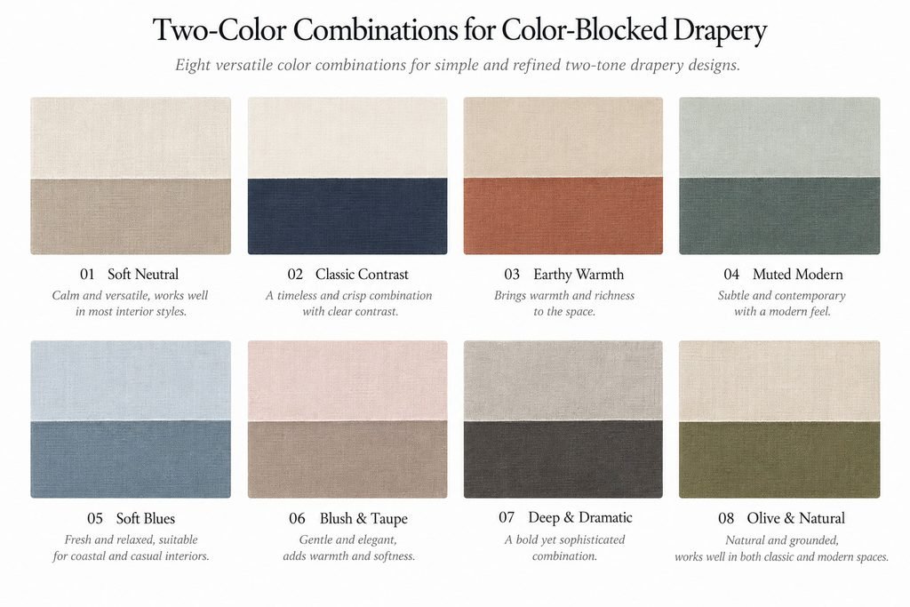
The following palette studies are organized into three groups: two-color combinations, three-color combinations, and combinations featuring a narrow contrast band.
These palettes are intended as starting points. Individual colors can be adjusted to suit the fabrics, lighting, and overall interior scheme.
Two-Color Combinations
Two-color combinations offer a straightforward way to establish contrast or subtle variation.
Soft neutrals, such as ivory and taupe, create a quiet layered appearance.
Stronger contrasts, such as ivory and navy, make the division between sections more prominent.
Other combinations introduce warmer earth tones, muted greens, dusty blues, or deeper charcoal shades.
The relationship between the two colors can be more important than the colors considered individually.
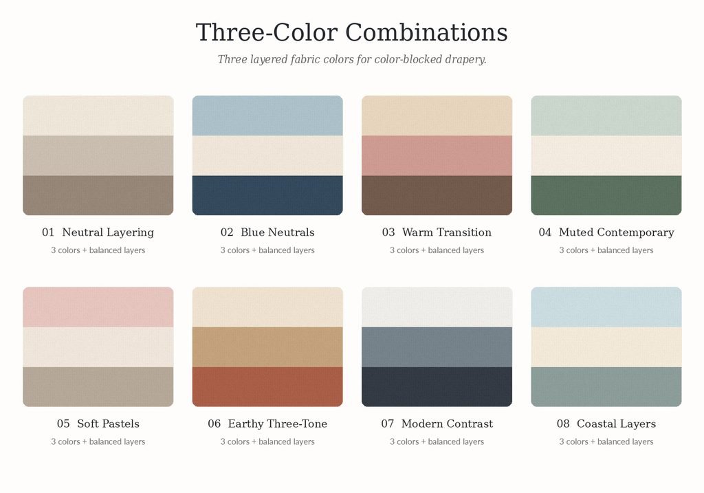
Three-Color Combinations
Three-color palettes allow for a more layered composition.
One color may serve as the main visual anchor, while the others create transitions or additional contrast.
A tonal palette can combine three related neutrals, while a more expressive composition might introduce a muted accent alongside two coordinating colors.
The position of each color also matters.
Even with the same three fabrics, changing their order from top to bottom can noticeably alter the overall effect.
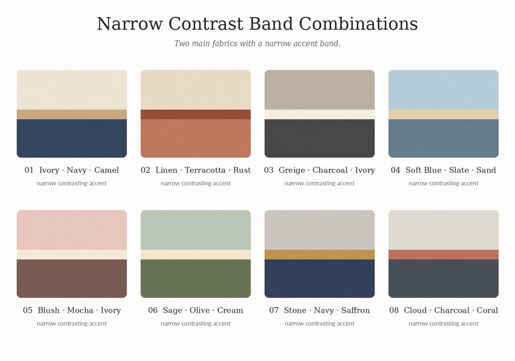
Narrow Contrast Band Combinations
A narrow contrast band serves a slightly different visual purpose from a large color block.
Because it occupies a smaller area, its role is often to emphasize a division or introduce a subtle accent.
The band may use a darker shade, a lighter neutral, or a contrasting color that connects with another element in the room.
It does not always need to be bright or strongly saturated. A shift in lightness, temperature, or tone may be enough to distinguish the band from the surrounding fabrics.
These combinations can be especially useful when the larger fabric sections are intended to remain relatively quiet.
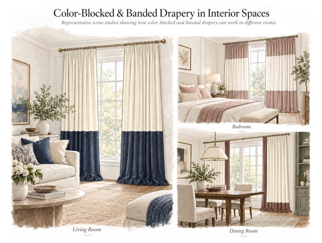
5. Color-Blocked Drapery in Interior Spaces
The same color-blocking concept can take on a different character depending on the interior in which it is used.
In a living room, a darker bottom block may connect visually with accent pillows, furniture, or other decorative elements.
In a bedroom, softer combinations and three-section designs can introduce color variation while maintaining a coordinated appearance.
In a dining room, a contrasting leading-edge band may emphasize the vertical lines of the window treatment and relate to surrounding architectural details.
These applications are not limited to particular rooms. The most appropriate design depends on the window proportions, surrounding finishes, desired atmosphere, and overall interior composition.
6. A Few Design Considerations
Although this article focuses on visual design, fabric compatibility is an important consideration when planning color-blocked or banded drapery.
Whenever possible, fabrics from the same collection or with similar construction and performance characteristics are a good starting point. Differences in fabric weight, thickness, shrinkage, dimensional stability, and draping behavior may affect how the joined sections hang together.
Fabrics should not be selected based on color alone. Even when colors coordinate beautifully, the materials may behave differently during cutting, sewing, pressing, or subsequent care, potentially resulting in puckering, uneven seams, or distortion.
When combining different fabrics, reviewing their specifications and testing their compatibility before fabrication is recommended.
The illustrations and color palettes in this guide are intended as design references. Final fabric selections and construction methods should be confirmed according to the materials and project requirements.
Final Thoughts
Color-blocked and banded drapery offers a wide range of design possibilities through relatively simple changes in color placement, proportion, and fabric combinations.
From two-tone panels and repeated horizontal blocks to narrow decorative bands and contrasting leading edges, each variation creates a different visual relationship between the drapery and the surrounding space.
I hope this collection serves as a useful reference when comparing design options, exploring proportions, or developing color combinations for future projects.
Fabric joining, seam treatments, and construction details will be discussed separately in the next article.